Get an estimate

10 Best Opaque Stained Glass Sheets for Every Project

Opaque Stained Glass Sheets can bring a bold, steady color to a window panel, cabinet insert, lamp, or mosaic. They can also add privacy where clear glass would reveal too much. But “opaque” does not mean every sheet looks or behaves the same. Some surfaces are matte; others have ripples, streaks, or subtle color shifts. Light may pass through some sheets, while others appear nearly solid.

A line often attributed to glass artist and designer Louis Comfort Tiffany says, “Color is to the eye what music is to the ear.” It’s a useful thought when choosing glass: color changes with the light around it. Check a sample near the project site, not only under bright studio lamps. Notice how it looks at noon and again in the evening. Small details matter.

This guide to the 10 best Opaque Stained Glass Sheets considers color, surface texture, consistency, and practical handling. It also looks at how each option may suit a particular project, from a quiet privacy panel to a vivid decorative accent. Before buying, confirm the sheet’s thickness and dimensions, and check whether its finish matches your design. If possible, test a small offcut with your scoring and cutting tools. That extra step can prevent an expensive mismatch. It is not foolproof, though; glass can vary, and careful planning cannot remove every surprise.
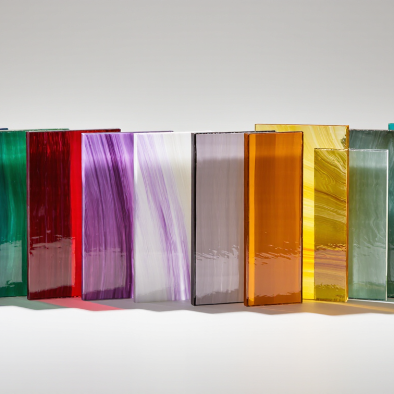
10 Best Opaque Stained Glass Sheets for Every Project

What Opaque Stained Glass Sheets Are and How They Differ

Opaque stained glass is made to conceal what lies behind it, rather than provide a clear view through the sheet. Its color and surface remain visible, while objects on the other side appear blurred or hidden. Unlike transparent glass, it does not create crisp views or sharp light patterns. Light behaves differently. Depending on the glass’s density and finish, a strong light source may show through faintly, or barely at all. Hold a sample near a window and then against a darker background; the color can look surprisingly different.

Opaque sheets are useful when a project needs bold color, privacy, or a solid visual field. Makers use them in panels, cabinet inserts, decorative accents, and designs where clear glass would distract from the shapes. The material may be smooth, mottled, or textured, so the surface affects how neighboring pieces look together.

In practice, a color that seems even in a small sample can vary across a larger sheet. That can be frustrating. Check the sheet under the lighting your finished piece will use, and consider how its edges will sit beside transparent or translucent glass. These categories can overlap in appearance, so a quick visual check is not always enough. A small test piece can reveal more than a color chart.

Key Features to Compare Before Choosing a Sheet

Compare opacity under the light your project will actually use. A sheet that looks solid on a workbench may reveal shadows near a bright window. Check color consistency across the full sheet, not just one corner. Texture matters, too: ripples soften outlines, while smoother surfaces preserve crisp shapes. Compare thickness and sheet dimensions against your cutting plan and frame. A mismatch can mean extra trimming or visible unevenness.

Material data offers context, not a quality score. The USGS Mineral Commodity Summaries 2024 estimated U.S. industrial sand and gravel production at 120 million metric tons in 2023. Silica is a major glassmaking input, but that figure does not tell you whether a particular sheet has consistent color or opacity. Ask for product specifications and inspect a sample. I would not rely on a product photo alone; screens shift color, and samples can still vary.

Tips: View a small sample against both a dark background and a bright light. Check for bubbles, scratches, and edge chips before cutting. Note any slight variation; handmade-looking texture may suit one design, but frustrate another.

Ten Top Opaque Stained Glass Sheets for Different Projects

Opaque stained glass is useful when a project needs solid color, visual privacy, or strong contrast. White opal works well in cabinet inserts, where it softens the view without looking busy. Black glass creates crisp borders in geometric panels. Red adds a clear focal point to small accents. Cobalt blue suits compact wall pieces and contemporary patterns. Test a small offcut first. Colors can look different against daylight.

For botanical designs, emerald green gives leaves a dense, steady color. Amber brings warmth to small hanging panels near a window. Purple can anchor jewel-like patterns, though too much may overpower delicate details. Turquoise pairs naturally with coastal motifs and pale grout. Pink is handy for flowers, but its tone may shift beside neighboring colors. Lay the pieces together before cutting. It saves rework.

A tenth option is mottled or streaked opaque glass, which adds movement to mosaics and abstract panels. Its pattern can vary across one sheet, so plan cuts around the most useful areas. Check thickness and surface consistency before buying; sheets from different batches may not match perfectly. Wear eye protection, handle cut edges carefully, and use tools suited to the glass. A slightly uneven color plan can still feel intentional.

Opaque Stained Glass Sheet Planning for Common Projects

Estimated glass area is calculated from the example dimensions shown by each project category. These are planning examples, not fixed standards; allow extra material for cutting and breakage.

How to Match Color, Texture, and Opacity to Your Design

Opaque glass is not simply “light-blocking.” Its color can shift when sunlight passes through it, while surface texture changes how highlights spread across a room. Hold samples against a window at morning, noon, and dusk. Test it at noon. A warm amber may look rich in a studio, then turn muddy beside a cool gray wall.

For a luminous partition, compare sheets against the actual background and viewing distance. IES LM-83 uses sDA300/50: a daylight metric based on at least 300 lux for 50% of occupied hours. It does not rate decorative glass, but it reminds designers to consider how much daylight a space receives before choosing dense opacity. For privacy panels, check silhouettes from both sides; a sheet that looks solid on a table may reveal shapes when backlit. I still find texture easy to overvalue. Small ripples can scatter light beautifully, but they may also blur painted details. Order full-size samples when possible, and record color, texture, and opacity under the project’s real lighting. One more check: inspect the cut edges, where color density can look different from the center.

How to Cut, Shape, and Finish Opaque Stained Glass Safely

Opaque stained glass can hide small flaws until a cut exposes them. Check both faces under angled light, then mark the line with a fine-tip marker.

Wear safety glasses with side shields; tiny chips can spring farther than expected.

NIOSH reports that about 2,000 U.S. workers seek medical treatment for job-related eye injuries each day. That figure covers workplaces, not hobby studios, but it is a useful reminder to protect your eyes.

Keep the sheet flat on a clean, stable surface. Score once with steady pressure, using a glass cutter suited to the material. A shallow, continuous score is better than repeated passes.

I still find it tempting to press harder when a line looks faint. Usually, that makes the break less predictable.

Use running pliers to open the score gradually, keeping your hands clear of the edge. For small curves, remove modest pieces with grozing pliers rather than forcing a long break.

Grind edges with water, following the tool’s instructions; avoid dry grinding and sweeping glass dust.

OSHA notes that suitable eye protection can prevent or reduce the severity of many eye injuries, often cited at about 90 percent. Treat that as a broad workplace estimate, not a guarantee for glasswork.

Rinse the piece, inspect the edge by touch only after it is clean, and smooth sharp spots before fitting or foiling. The finish may still look uneven. Check it again.